Design Trends: Signwriting is back baby!
Alice McNeil
8
minute read
Buttermark Design - Week-trend 1
Earlier today, while walking along Bradford-on-Avon’s canal I couldn’t help but feel inspired by the typographic signwriting on the canal boats. This, paired with every designer I know joining the global conversation around NYC mayor Zohran’s graphically powerful campaign, leads me to conclude the signwriting trend is totally back!
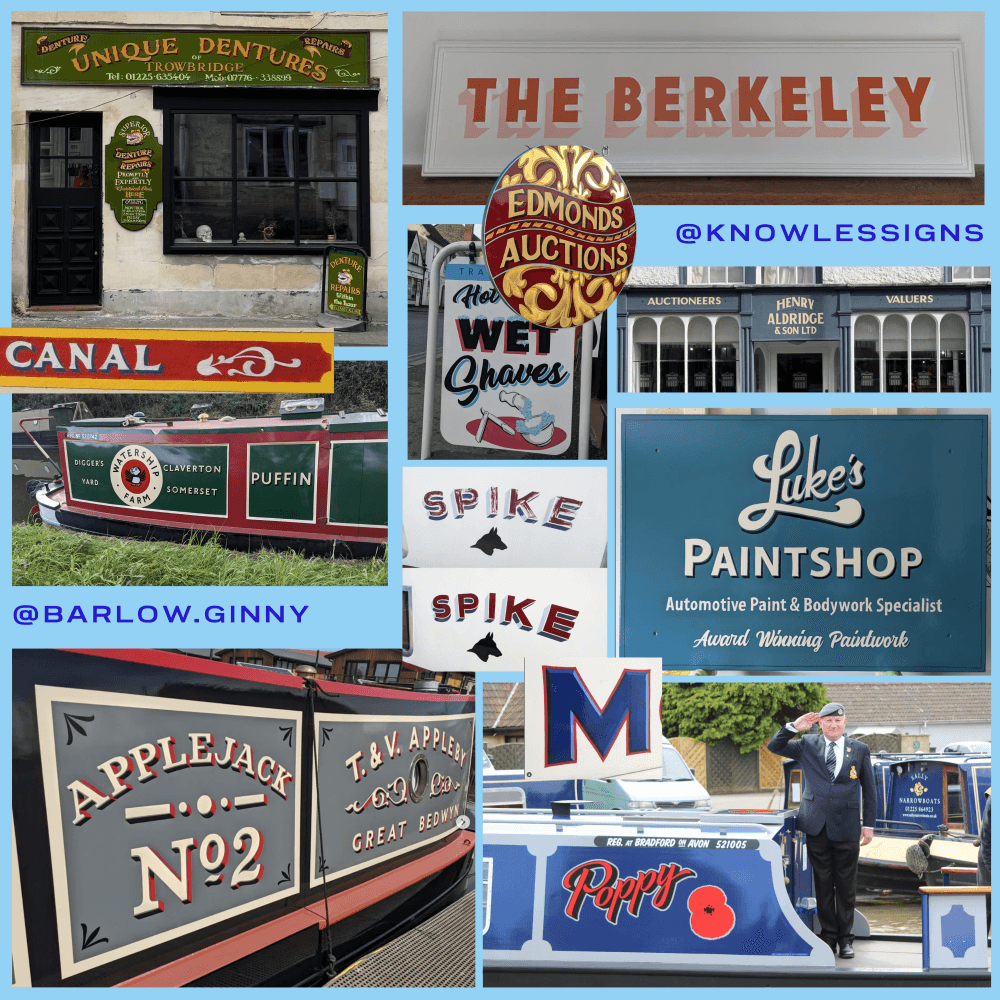
Signwriting in Wiltshire - Credit to artists Ginny Barlow and Oliver Knowles
Trend may not be the right word here given signwriting has been a fundamental building block for advertising and branding for centuries. An example of one of the oldest business advertisements, dated around 1820, can be found on the corner of George Street in Bath, opposite Imperial Tattoo (who’s stunning gold-leaf lettering deserves an honourable mention anyway!). This faded hand-painted sign is over 200 years old, and it offers a beautiful juxtaposition to the Pizza GoGo logo beneath it…
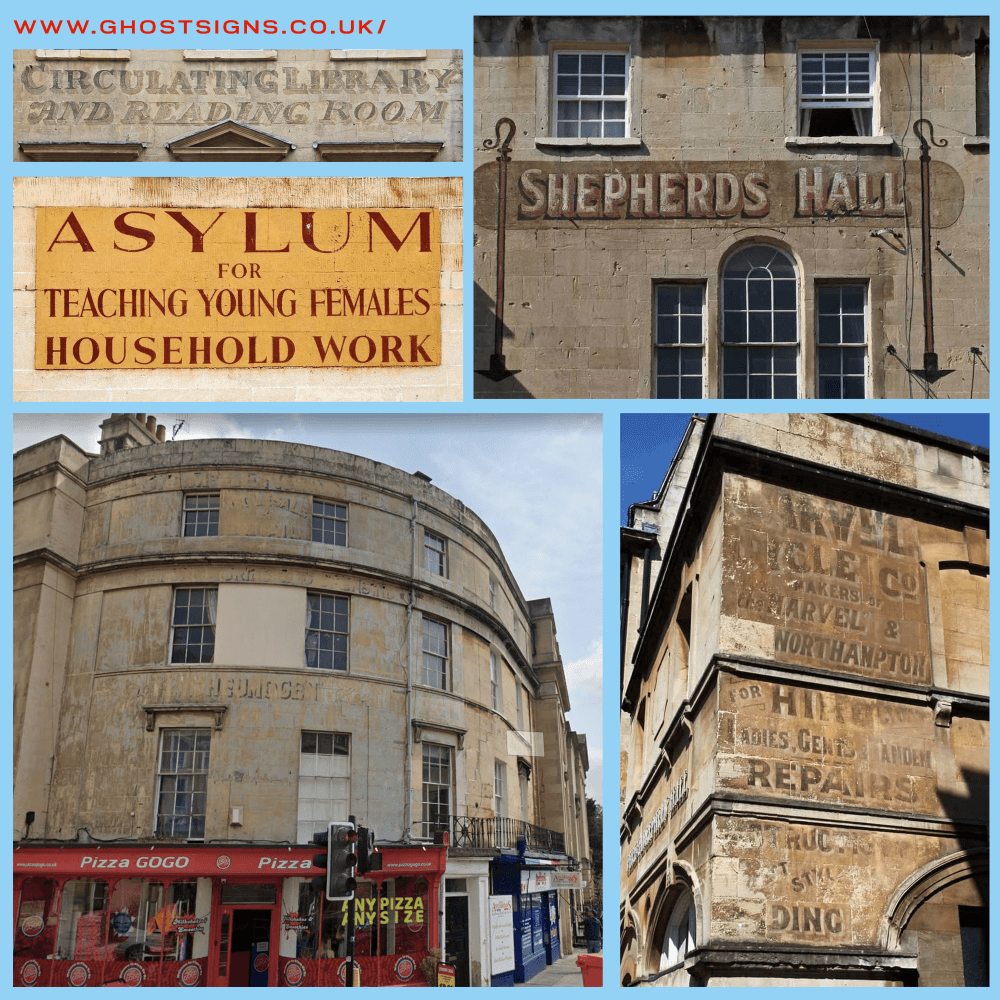
'Ghost Signs' around Bath UK - Credit 'Ghost Signs' and book 'Ghost Signs of Bath'
One piece of sign painting I hadn’t noticed around Bath, until my research lead me to the “Ghost Signs of Bath” book, is the “Asylum for Teaching Young Girls Household Work”. It can be seen on Gay Hill in Bath – and I fear that would’ve been my fate had a Victorian matron seen my lacklustre dusting and shabby ironing.
So what makes this ancient art of hand-drawn fonts so impactful that we’ve continued to use it for over 200 years?
Back in the day, hand-lettering was literally the only game in town, no digital fonts, no laser printers, just a steady hand, a pot of paint and a ladder. It was the original ‘bespoke’ branding, every curve and flourish carried the maker’s fingerprint, turning a simple shop name into an act of craft. Fast-forward to now and the same imperfections are catnip for a generation drowning in AI-generated sameness. In a world of algorithm-slop and Blanding, a wobbly serif screams “a real human did this” and that authenticity hits the nostalgia sweet spot.
As of late there’s been a big surge in nostalgia-core, in visual trends generally. Both in fashion and in visual design, we are collectively referencing older, simpler times. The resistance to the AI revolution comes out sideways as a gravitation towards human-made, hand-drawn and often imperfect art forms; signwriting ticks these boxes perfectly. In a world where our attention span is commoditised and sold to the highest bidder we are craving authenticity.
I’ve seen rebellion manifest as a resurgence of popularity for old tech – I was shocked to see an old iPod shuffle (my first real piece of technology as a 14-year-old, yes I’m that young/old) sold on eBay for over £300. Which of course spurred me on to empty that old tech drawer and see if any of my, relatively recent, technology would resell for profit. Suddenly owning a song and listening to it without being bombarded with ads and having your recreational time sold to the ruthless capitalist machine, sounds quite appealing to the younger generation.
At the heart of it humans want human connection.
We’ve all seen the campaign graphics for Zohran Mamdani in New York, right? Doesn’t it feel strangely nostalgic, like you’ve seen it before. To me it feels familiar in a way that invokes subconscious trust, it’s a seller at a market stall handwriting their price cards, it’s the font from the shop sign for your favourite bookshop, it’s thick markers on placards to get your voice heard, it all feels authentic. It's not pristine digital type; it's got that organic, market-sign wobble, like enamel-painted shop fronts but scaled up for star power.
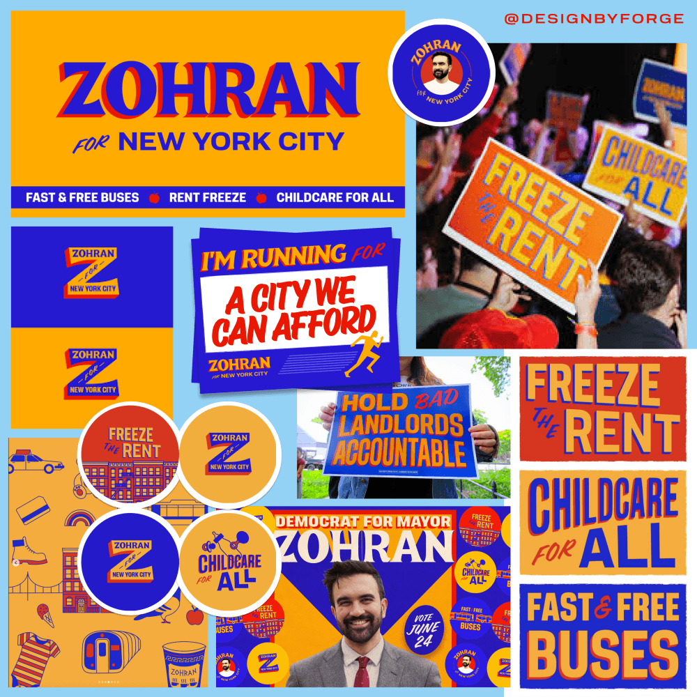
Mamdani Zohran campaign for Mayor of New York 2025 - Graphic Design credit to Design by Forge
It's the anti-corporate, human-made energy that screams ‘we’re doing it differently’ drawing from NYC's bodega awnings, the blur of yellow taxis, and the inevitable MetroCard hues, while nodding to Mamdani's South Asian roots (he's the son of Indian filmmaker Mira Nair).
From the 1950s onwards, cinema became a central part of everyday recreation in India. Bollywood film posters, often hand-painted by skilled artists in places like Mumbai’s Chor Bazaar or studios such as Balkrishn Arts, were key to promoting movies. These were typically large hoardings (around 10 to 20 feet wide) created with oil paints on canvas, using bold colours, expressive typography, and dramatic star portraits. These epic posters were installed outside theatres across India to lure crowds with their visual drama, much like the visual design attention the new NYC Major is getting!
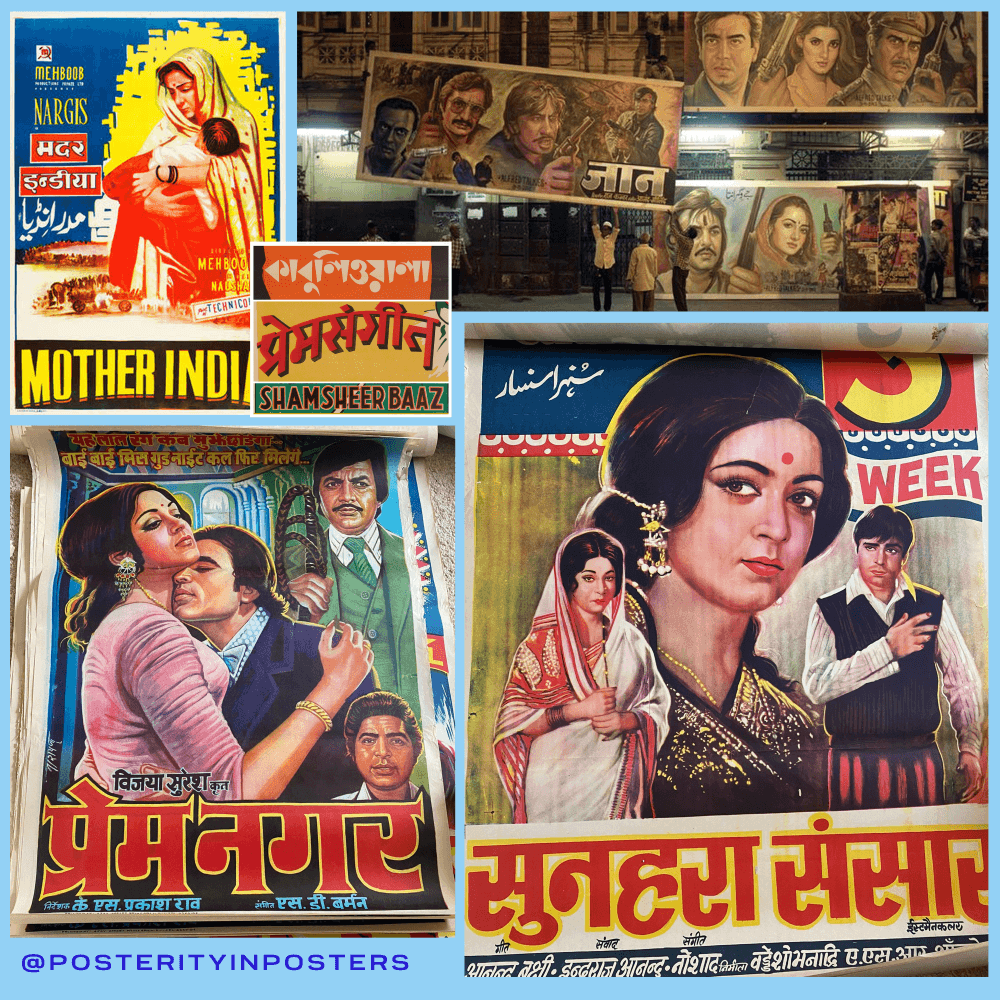
Vintage Indian Film Posters Inspiration - Credit to Posterity in Posters
I didn’t have to look far for real examples of this style, as one of our recent clients, Posterity in Posters, specialises in antique posters and advertising. Their collection features a series of hand-painted Indian cinema posters that carry the same charm: confident serifs, vibrant primaries, and those signature drop shadows. It’s easy to see how that same energy and craftsmanship found its way into Zohran’s campaign graphics.
Oh and the colours! It’s the primary triad, the anything-is-possible-when-you’re-paint-mixing, it’s the love, the life and the fire of a Bollywood classic; where marigold yellows evoke festive diyas, crimson reds amp up passionate danger, and deep blues ground the drama (often with starry night skies or royal motifs). It flips US patriotic reds and blues into something warmer and less binary, its more Om Shanti Om (2007) than Obama '08.
Taking this new twist on a legacy design style injects a new sense of energy and modernism into the visuals, its familiar and yet completely new, it contradicts the perfect way. That same essence has been harnessed by Forge (@designbyforge) to create visual experience that you can’t help but notice.
I love brand design but wouldn’t claim a great brand makes you win elections - but no one can deny it helps
Resources and credits because you should always give credit
Want to read more about Ghost Signs, Sam Roberts tells the stories of the fading remains of hand-painted advertising, a large portion of these can be found in Bath: https://ghostsigns.co.uk/category/sign-stories/
More about the book "Ghost Signs of Bath": https://ghostsigns.co.uk/2016/11/new-book-ghost-signs-of-bath/
The Zohran Campaign visual identity was created by Forge: https://www.forge.coop/ @designedbyforge
The fonts used in the Zohran Campaign are by Matthew Hinders-Anderson https://wehtt.am/fonts/ (Bonus they are free for non-commercial use)
Fonts I used to create the Buttermark signwriting mockup: Boheld Free, Sendang Mulyo and Union Gothic (Expanded 400) if you want to create your own campaign for NYC Mayor.
Posterity in Posters - we built their eccomerce store! https://posterityinposters.com/ Check them out for antiques, vintage posters and prints, all carefully selected by our friend and posters-expert, Felix.
Real, local artist that are preserving signwriting as an art form:
@barlow.ginny - Awesome traditional sign writer - Ginny is probably responsible for most of the inspiring sign writing I saw on the canal in Bradford on Avon today, therefore responsible for setting me off on this monologue!
@knowlessigns - Oliver is a talented commercial sign writer who’s stunning shopfront signs crown some of my favourite small businesses across Wiltshire (@somabodyclinic @roastandtoast.trowbridge @milktownbrewingcompany and Ash Brown is very excited to visit @theoldemporiumdevizes/ @henryaldridgeauctioneers)
One day I will do a logo that is good enough to be painted on a building, who knows that may be my only lasting legacy on this world…
On a lighter note if you have a business that would like our help to create a showstopping brand experience, please pop me a message! alice@buttermark.design